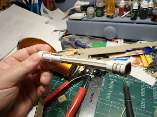
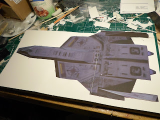
So I've got to give a shout out to a fellow modeler with a Wing Commander obsession. Whiplash, thank you for your help and encouragement sir!
So what am I thanking Whiplash for? Well first off, Whiplash is a member of the Wing Commander community I met via the wcnews.com forums when I posted work on my Excalibur there. Whip was directed to my thread where he then provided some guidance to me based on his own project. Whiplash had done a similar project to my own a bit of a ways back in that he built a model of a Wing Commander fighter. He chose to base his project on the
Hellcat V general purpose fighter and he chose to work in wood rather then plastic, but he was able to provide some extremely valuable insight in translating information from 2D designs and images to 3D designs and plans.
The single biggest thing he told me about was how the limits of the technology used in the games at the time does not lend itself well to gaining measurement for production of a model and instead suggested I use art work for my basis rather then in-game screen shots while using in-game cut scene shots to collect detail information. So to that end I assembled a pair of fairly substantial libraries of
artistic references and
cut scene frames for the Excalibur.
Beyond all of that I did start crunching some numbers for the model
again based on the Warbird images. I've decided I'm going to scale back a
bit for the project and rather then do a 16" long model, I'm going to
do a 12" long model instead. I've done lots of small scratch build jobs
before, but never a full blow from the ground up total scratch built
model before. And I'm thinking about doing some lighting effects in the
model as well. So the 12" version will be easier to manager and I think
closer to my skill set at present. I want to challenge myself, not waste
my energy and materials.
So, I took the warbirds image and pulled it into Photoshop where I upped
the size by a factor of 6 so I have some room to work and make notes.
The image is small enough that I will be forced to 'interpret' a lot of
details, but that's what the reference library is for. With the image in
Photoshop I started working out some numbers. I had to go way back to
Algebra and Geometry to remember how to work with scales and conversions
for this and I'm not totally sure my math is accurate. So if anyone who
actually knows what they are feel see a mistake, please point it out.
Here is what I have:

Whiplash has also provided me a break down how he went about translating the sizes of the 2"x2" thumbnail images into something large enough to be used. It helped shed a lot of light on the approach and the hows of why it
worked for him. It also gave me some inspiration for a new direction to
take the project. As he explained, trying to measure the warbirds image that
is less then 2" long is only going to lead me to compounding errors
from earlier in the project. Don't ask me why, but that clicked with me
in regards to digital graphics. I'll explain:
See in digital graphics you have 2 types of graphical engines each with
their benefits and minuses to design. The first is known Raster
graphics, or sometimes referred to has bit-map pictures. This format
uses individual colors dots to render an image. The more dots you have
in a given space the sharper the image can be. A line is simply a series
of dots of comparable color. This format has the advantage of being
capable of storing far more graphical information and being the
foundation most directly based in traditional art work so many of the
concepts from that medium translate to this format. The second type of
graphic is known as Vector graphics. These use mathematics to form
shapes rather then recording each individual position of every point
contained in the image. This has the advantage of being vastly easier
for a computer to deal with but doesn't translate from math to art very
well.
Why am I bringing this up? Well, the two graphic types have another
consideration between them, how well they scale up or down. See a
bit-map can only be scaled by either adding or removing details. How the
program add details will effect how well the image scales up, but
generally you can only scale a bit-map image up about 50-60% before you
start seeing a noticeable loss in sharpness as additional quasi-random
extra material is added.
As an example, look at the corner on the right side of the Excalibur
image where the forward section of the fuselage meets the side of the
wing and side mounts. On the 1 1/2" sized image it's moderately decent.
But enlarge it about 400% (so that the over all image would be about
4.5" long for reference) and suddenly it stops looking anywhere near as
sharp.
Vector Graphics however, because they are mathematically based can scale
infinity. The program simply remaps the location and calculates what's
between the points as needed.
So why did I just explain all of that? Well you gave me the idea to
start with a series of vector graphics, based on the Warbirds images,
then upscale those vectors to the size I need them. Since the vectors
expand infinitely, there's no lose of detail in the process. I started
with just tracing the major sections visible on the Warbirds image. I
did some digging and found my hard copy of the Wing Commander 3 stuff
and scanned the warbirds images at an obscenely high resolution of 2700
dpi then pulled that scan into photoshop (as an aside, it's always a
challenge working with 5"x2" image that's a staggering 400megs

in size) and went to work with the pen toll to generate the vector
graphics. the high resolution pulled out some details, but the size of
the original image simply doesn't have a lot of detail to start with.
Remember how I said enlarging a bit-map image is done by adding
material? Well scanning a printed image at such a resolution results in
basically the same thing. End result? I could trace out the body, the
engines, and the cockpit. The rest... eh I kind of had to take some
artistic license with those.
Remember that
library of images I assembled of the Excalibur? Well I used that a lot in this process. I primarily referenced the "
armada" rendering of the Excalibur for filling in the details that were lost in the up-scaling of the scan. So after a couple hours worth of work, I assembled the following top-down image of the Excalibur with (website friendly version displayed. If you want to grab the 300 DPI version it's linked
here)
I mentioned that these are first passes, why is that? Well... it's
because they don't match up exactly with each other. It's too late for
me to go into all details but as an example. The widest part of the
front boom where the cockpit is, it is widest on the front view,
narrowest on the top view, and just slightly narrower in the bottom
view.
So what does this mean? Well, it means I have to go back, pair up the
line art pieces with each other and decide which part of which version I
want to take as the 'correct' version. While the web version of the
image above sizes out to be about 4" wide, I want to build a 12" model
from these designs. So if I scale everything up by a factor of 3, and I
have one part from the bottom that is 1mm wider, then the same part from
the top view, but the rear version is 1mm to the left, I'll wind up
with a part that started out as a rectangular cube but when built comes
out as a lop-sided rhombus. So guess what I get to do over the next few
days....


